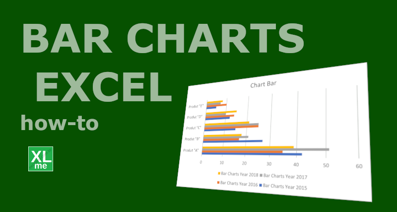
Bar charts are often used in dashboards because it visually represents the data in spreadsheet in a format that makes complex data easier to understand.
To plot the bar chart in Excel you must:
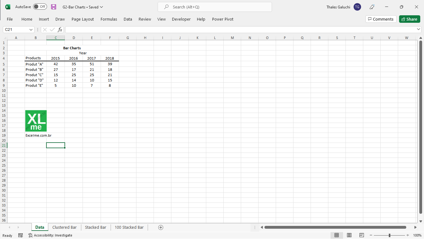
- Take a spreadsheet with data that can be separated into categories such as year, product and/or city.
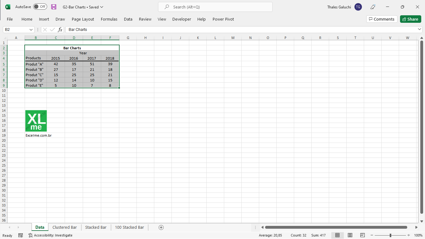
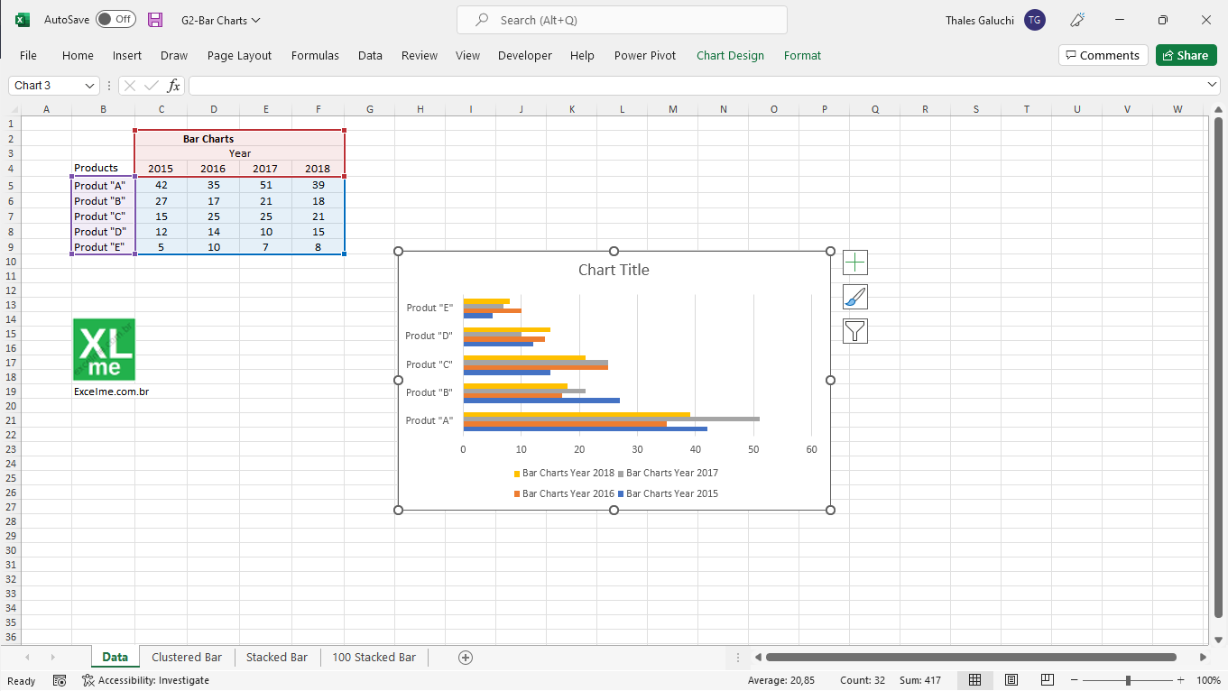
- Select cells with data, including row names and column titles.
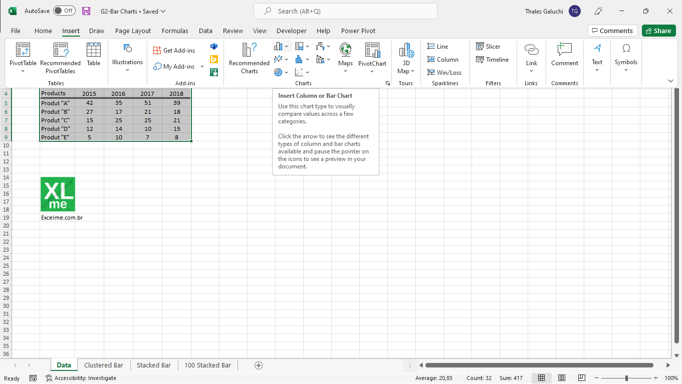
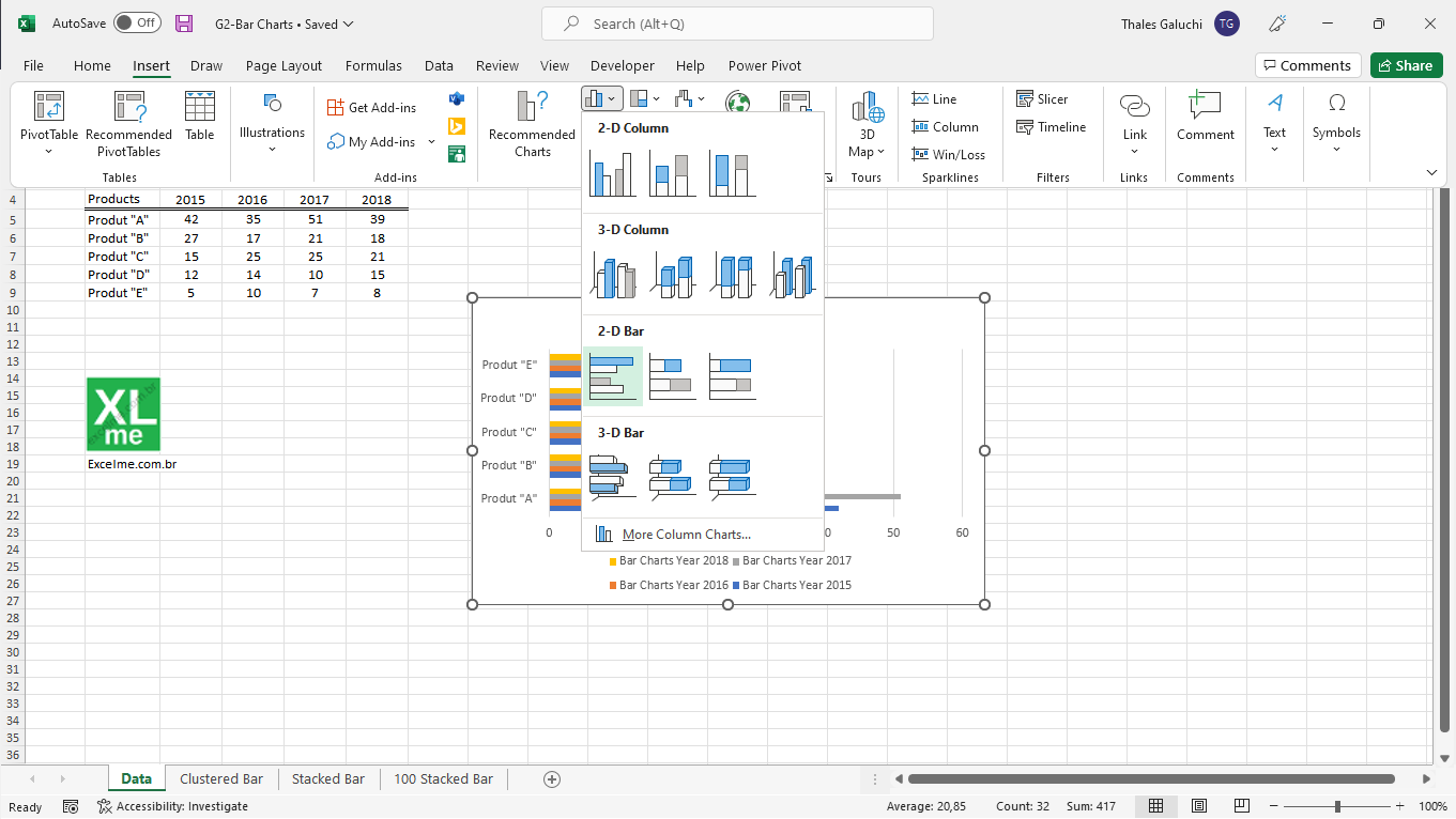
- Click Insert > Insert Column or Bar Chart (in the Charts section).
- Click on “Clustered Bars” (in the 2D Bar section).
- The graph will appear separated into categories according to the title of the lines. If the lines have no names, the categories are numbered.
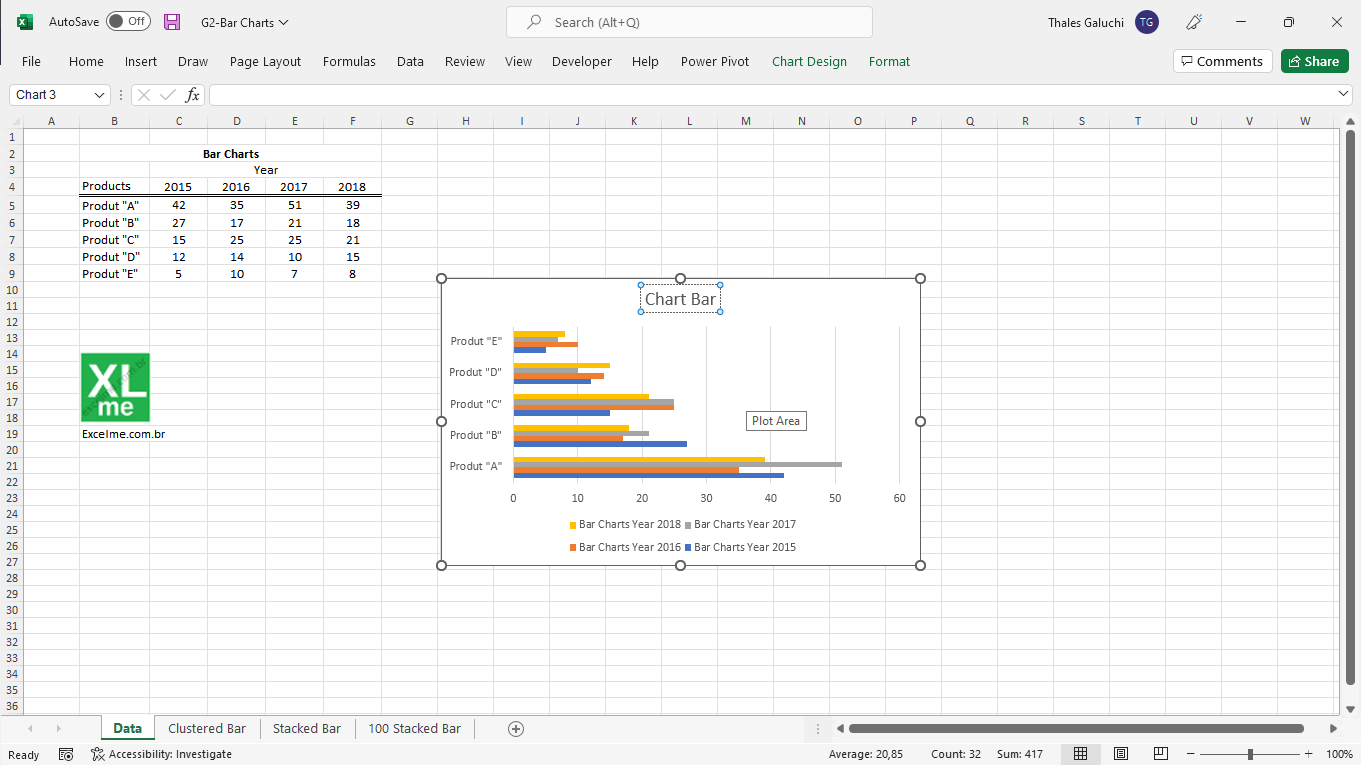
- Rename the main title of the Chart.
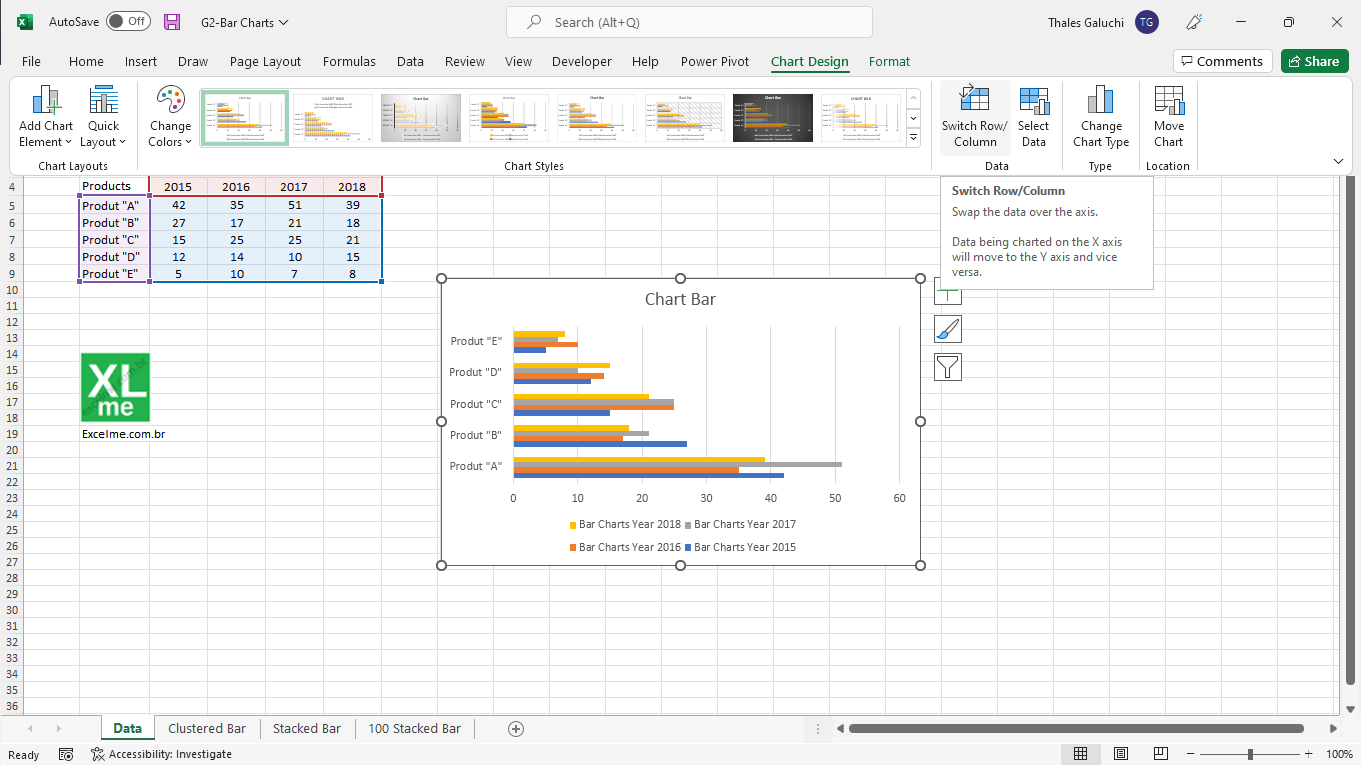
- If you want to use the categories used in the columns, select the chart, click “Chart Design” > “Switch Row/Column”
