People can make dozens of different types of charts In Excel. However, each type of data in a worksheet must be represented by the correct chart type. Otherwise, the chart become meaningless.
Graphs represent data from a table in a visual format, that is, a chart represents thousands of data. Whenever there is a table of data, you can make a graph.
What types of charts in Excel?
The main types of charts in Excel are bar charts, column charts, pie charts among others like:
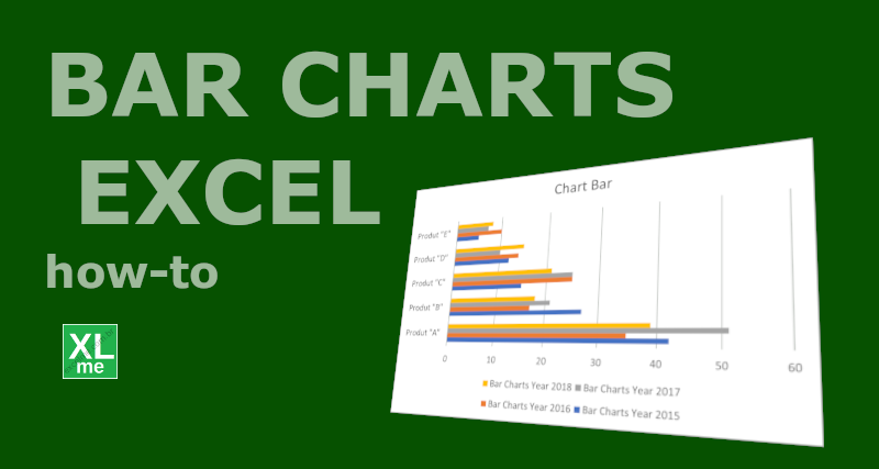
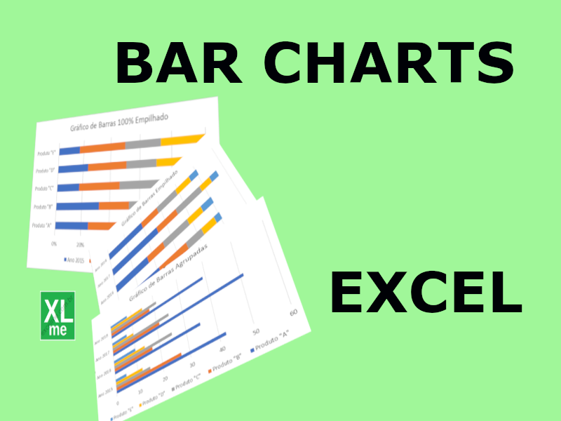
- bar charts, used to compare data features;
- stacked bar charts, that show how each category is composed by
- column chart (or vertical bars chart), also used to compare data features;
- pie chart , which represent the proportion of parts that make up a data category.
- line graph , useful to represent time series;
- area graph , which is a derivation of line graphs;
- scatter plot , which allow relating two categories of data to obtain equations and trends;
- bubble chart are used to represent three data series in a 2D chart;
- histogram, the appropriate way to represent the distribution of a data category in data analysis;
- narrow box (box-and-whisker) that statistically represent the distribution of data also widely used in data analysis;
There are other types in Excel with very specific applications.
What charts in Excel are better?
Excel is the Microsoft Office application used for data analysis. Then, you can make different types of charts in Excel. Even some types of charts can be “combined” to improve the visualization of the data.
To get started, the new users should get used to the basic chart types in Excel. Every new user should start plotting in Excel bars, columns, pie, lines, or scatter charts. Although they are the simpler charts, they are the main types of Excel charts.
Despite basic chart types in Excel, basic charts are capable to produce excellent dashboards. Some types of graphs, with too many resources, end up harming the visualization of the data. Thus, the simpler the better.
3D Charts in Excel
In Excel, advanced charts are those that offer more visual capabilities, such as 3D charts. In 3D graphics, the images produced are more beautiful. However, beautiful graphics are often not functional as they distort the data represented.
3D charts are available in Excel for column, bar, line, area, and pie charts. Even so, this type of chart is not recommended for more rigorous data analysis. 3D graphics are mostly used to embellish data rather than justify decisions.
Example of Charts in Excel
The example below shows 4 different charts made with same data. The graphs are: columns, 3D columns, pie and 3D pie.
Look at the 4 graphs and answer: “In which of the graphs is it easier to determine the second most frequent nationality of visitors?
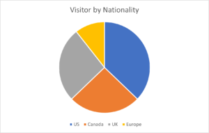
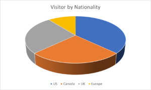
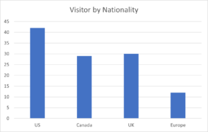
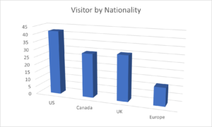
As you can see, the 2D column chart is the chart that best represents the above data. In the 3D column chart, the difference between Argentina and Uruguay is not as clear as in the 2D column chart.
How to make a bar chart in Excel
Bar charts are often used in dashboards because it visually represents the data in spreadsheet…
Bar Charts in Excel
Bar charts represent the data from spreadsheets in the form of horizontal bars, with each…
Sum in Excel – 4 different forms
Sum in Excel is the most common operation in a spreadsheet. There are at least…
History of electronic spreadsheets: Excel, Lotus123 and VisiCalc
Electronic spreadsheet is a table made in a computer that performs calculations, plot charts and…
What is electronic spreadsheet? What is a spreadsheet for?
Electronic spreadsheets are tables composed by columns (vertical) and rows (horizontal), that has the function…
